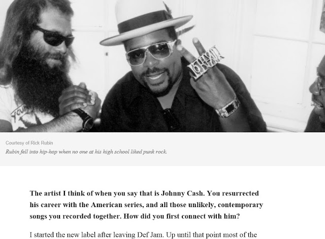
Rick Rubin article. All articles should take this form.
A decade writing things down on the internet later, our tools still suck balls. Hard. Anil Dash has a wishlist that doesn’t quite do it for me. What I would love:
– Distraction free environment like this, only you publish directly on the web.
– Formatting should happen in different ways, markdown if you want or standard word processor shortcuts or html if you’re crazy. Choice.
– Inserting pictures. It really helps reading an article and inserting pictures is a massive pain in the ass right now. It should be as simple as drag and drop with a system that automatically uploads to a chosen destination the picture and links to the original, all in one click. That would be the shit, if I may.
– Rendering. Well, that would be swell if again it was super easy to change/add simple but crucial things like fonts or background. We should be able to have magazine quality blogs (like Quartz or Medium) in just a couple of clicks, taps or shortcuts whatever floats your boat. More than easy to read whatever device we use, nice looking and peaceful.
I guess WordPress kind of does all of that (except for the first one) but I don’t want to use anything in a browser. I dedicate the browser to consuming, not creating when native apps are ten times better in usage.
Web publishing has barely changed in ten years, time to kick the shit out of it with one-click mechanisms, privacy and awesome user experiences.