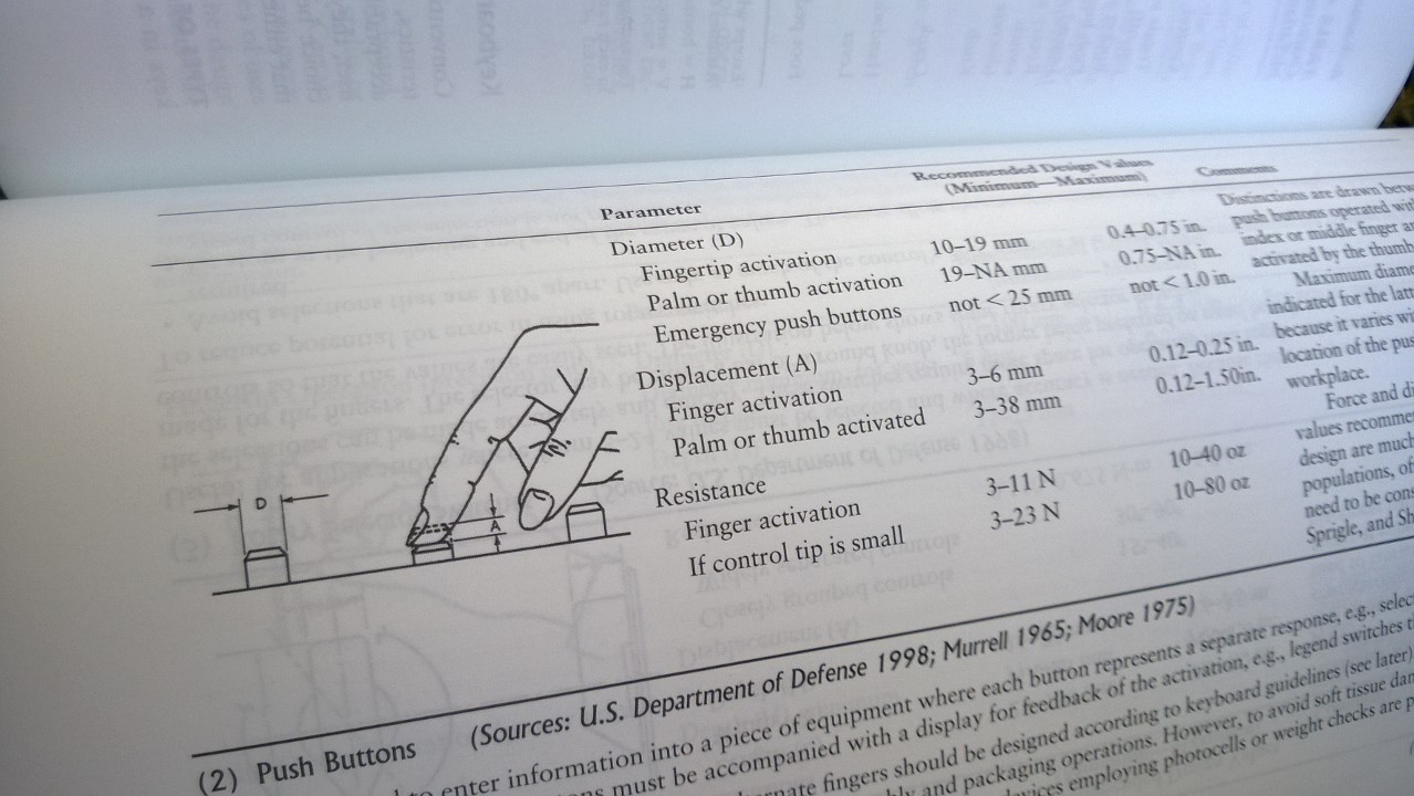
This is from Kodak’s Ergonomic Design for People at Work book.
It describes what’s the best design for a push button, using compiled data from 1998, 1965 and 1975, which combs through what a push button should be for men and women, small or tall, young and old.
It’s insanely detailed and yet, we rarely apply those designs that are meant to make our lives much better and easier.
What it tells me, which I really realize more and more, is that it’s not that we don’t have knowledge; it’s that we don’t do shit with it.
Even worse: we (and by we I mean you) believe in stuff! In this book I learned that screen glare is the absolute worst. Your eyes are going to work extra hard and you will end up with eye strain, headache, blurry vision, dry eyes and neck and shoulder pain.
That’s why all the most expensive laptops out there have mirrors instead of matte screens. Exactly. The company known as Apple is believed to be a design master by railing your eyes to the ground, starting at $999.
You don’t have to do it, though. Change. Seek good design.