The Metro UI is the shit. After a year and a half of my Windows Phone I can’t wait to get my hands on some Windows 8 goodness. Metro is really, really great I’m not kidding. Anything with icons simply looks like the past, from Windows 7 to iOS to Android. You look old and inefficient, guys. And XP? Oh boy.
Somehow Microsoft transformed apps in “apps”. You have an OS, a UI and services running through them. That’s it.
It’s a perfect mix between Software as Service and an operating system giving you full focus on data. The future, right now.
You don’t need visual designers on Metro (it’s perfectly clean and lean from the start of making “an app”), you need flow designers. On my phone, apps simply porting the icon paradigm and menus are the worst. In Metro flow is everything and when it’s well done it’s pretty perfect: data first, moving around is fast and fluid what the hell do you want? Exactly that.
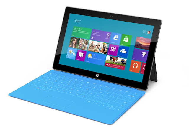
The new Microsoft Surface
Gizmodo does a great job at explaining what is great with this thing above. My first reaction was, this is too small. 10.6 inches? Meh. It might not be for me. But then thinking about the form factor, the touchscreen the pen and the keyboard (You can easily plug a gamepad too), the mobility and of course the great UI, it might be kind of the definitive computer for a lot of people if not most of people. It’s also a big “you need to aim that high in quality” heads up to OEMs.
In short between a new OS, new machines, new focus on design with Microsoft showing the way to PC manufacturers (and yes Dell and HP, what the fuck have you been doing for years?) while some totally get it by themselves, something interesting is happening. Now it’s up to developers to take advantage of that and play the platform game: the first good apps -that everyone will get as must have- can easily make you a millionaire. *wink wink*