After almost two years with a Windows Phone, I’m pretty excited to use Windows 8 and its not-so-new-to-me UI. I’m so over Win7 and any other icon-based experience interface.
This UI/UX is so efficient and relaxing at the same time. Here’s why.
Take the WP home screen for instance. When you look at it notifications appears on tiles, flipping over to display information. There’s nothing to do to get the information. The only thing you have to do is look at your screen. So even in this position of doing nothing, you actually get some minor things done (typically, knowing who liked your comment on FB or RT’d your tweet, email from someone specifically, new item on eBay, you name it).
It’s not only efficient, it’s relaxing. No pop-up, no weird-looking widget, no visual distraction but transition effects. No need of action like pulling a notification list or closing a popup. How many times did I tediously do that on my Android. It made me feel like becoming the machine’s bitch and this new UI frees me. It’s hard to describe but it feels great. I’m back in control being able to know what’s up/communicate in various ways in one instant.

Before, there was noise and confusion and a lot of clicks.
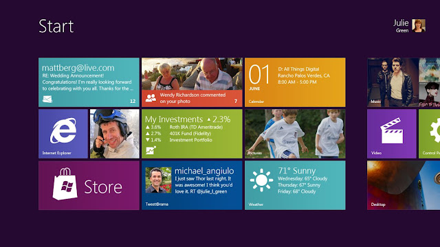
Now you just look, swipe or use. No “app launching”, more like “service launching” more than ever.
Other example, the classic desktop/taskbar/dock. It’s noisy to have that constantly in our view. How many times do we stare at it, searching things or visually wandering for nothing. Icons, pointless and aging concept that aimed at emulating an office desk. That is just not how we function in front of a computer anymore.
More than a decade that we have apps open at all time like email clients or browsers. We now don’t even turn our computer off but simply put them on sleep. And though we often use multiple apps, we don’t need them on sight all the time. Multitasking is BS and we only switch from one app to another. So Windows 8’s focus on full screen apps with easy switching between them makes sense. Again, efficiency and relaxation from the visual noise of a traditional desktop. Too many moving tiles? Turn them off or even better, go away from your machine. When you come back, know everything in one look, one swipe. Powerful, I’d say.
Icons are these weird shortcuts in our digital lives that don’t make so much sense today. Too static, useless and central to the experience. I’m glad they’re slowly going away from the common use of a computer with Windows 8. For work of course, file systems and icons will still be with us for a while.
It’s like the Windows 8 new start menu becomes a classy, modern living room to use everyday apps while the desktop becomes the clean, flattened workshop to create stuff and get complex shit done. All in one OS.
Mama like.
One reply on “Die icons, die”
[…] That was my first “sweet!” moment after upgrading my laptop to Windows 8 yesterday. For the rest well, it feels like what I suspected: […]