- It’s incredible how bad kitchens are designed in homes most of the time. Islands with awkward bar stools and non-matching dining table next, and a breakfast nook somewhere. Too complicated. A kitchen island with dining table projecting in one direction like in HHH, is the best design IMO.
- I’m a Horizontal Hoe but sometimes a bit of verticality is nice and E. Fay Jones is a king of his own with this:
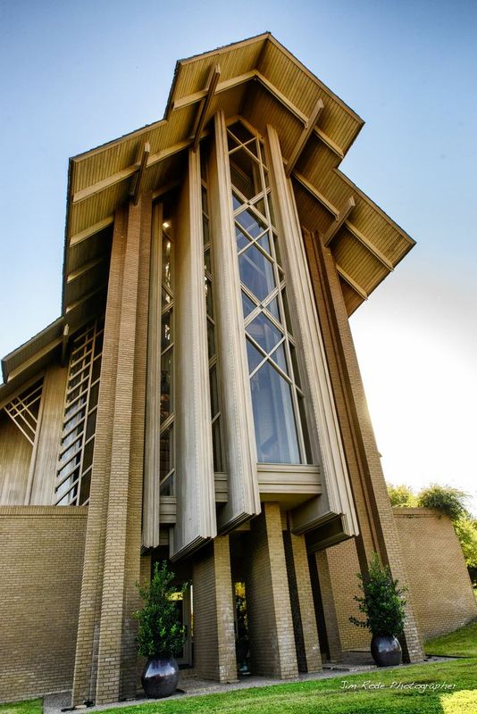
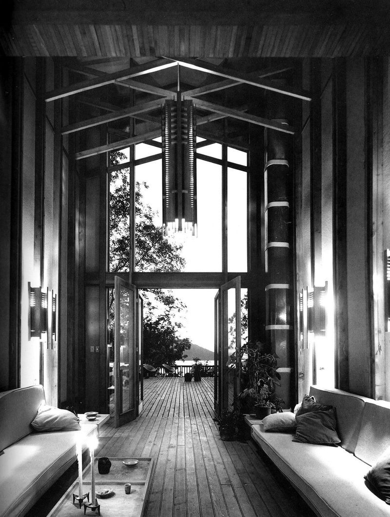
The stacking and repetition are finely done and I enjoy it. Stoneflower is an AirBnB by the way. I might. - Japan continues to blow my mind with designs and ideas. For instance, this one called Kokage by SUEP. Its cooling system is “chef’s kiss” They pump up cold water from the underground which then circulates into off-the-shelf underfloor heating panels fixed on walls! This means soft, radiant cooling, which is in terms of health, just the best. Affordable. And sustainable. Brilliant.
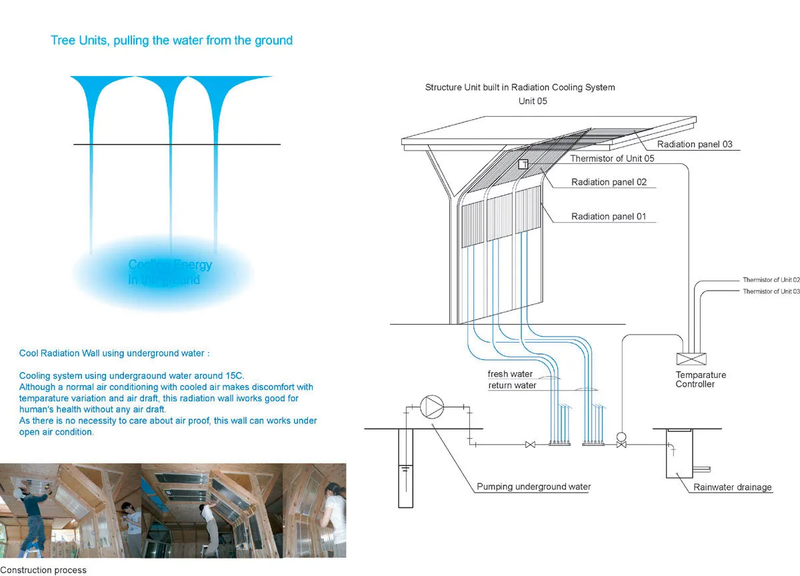
The wall shape is optimized for cooling, looking cool and kind of like a tree. They otherwise optimized sunlight by moving walls accordingly, giving space for pretty skylights:
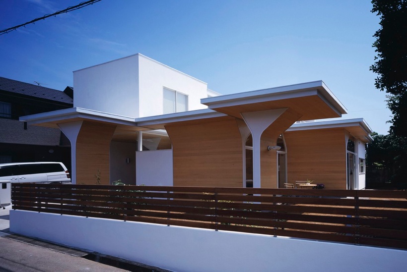

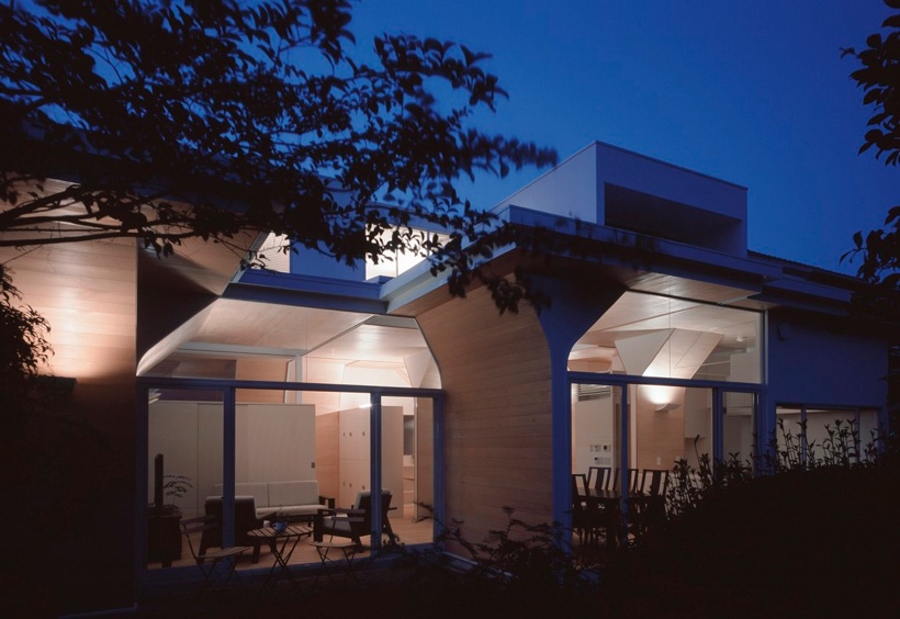
Using every single source of possibility, from the land to technology. SUEP’s approach is intensely holistic and I’m in love with that.
- The earth itself is a magnificent regulator of temperature: a mere 80cm/2.6 feet down and it is already significantly cooler. Why don’t we use this natural advantage for construction? Because the A/C business wouldn’t be worth $24B (US only) like it is today. Only Florida would run A/Cs and that would be great. We’re a league of morons.
- On the furniture side (which I kind of consider as “proximity architecture”), no doubt Eames and Knoll are just timeless. Thinking about having a couple of these in HHH:
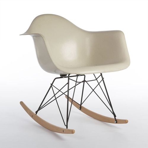
They’re just so comfortable to chop it up with a friend while listening to some music.